
Last Updated: July 2026
Softball Stats Dashboard
Overview —
Problem
Our team captain tracked game and player statistics throughout the season, but the raw spreadsheet data made it difficult to quickly understand team performance, compare players, or spot trends over time.
Solution
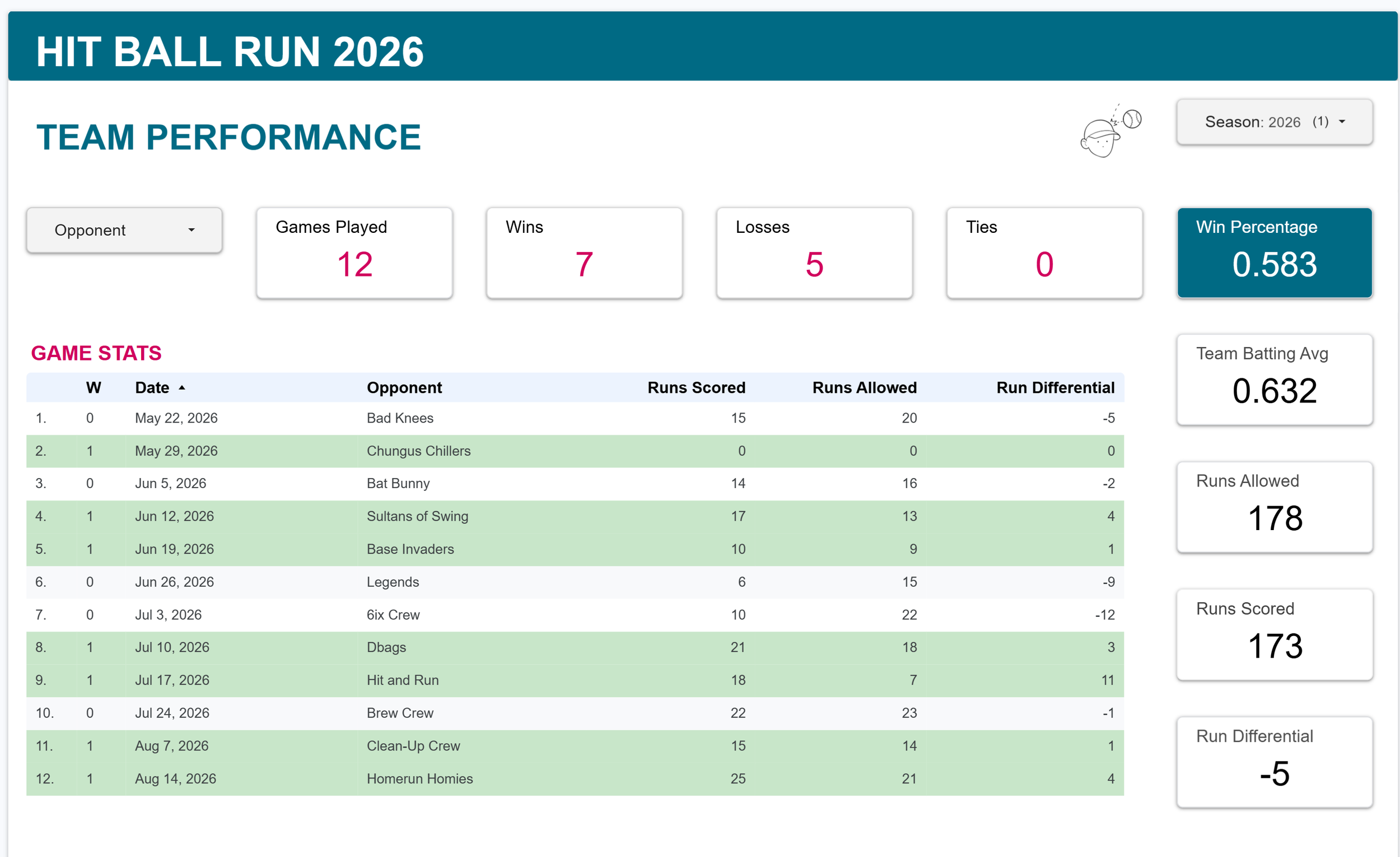
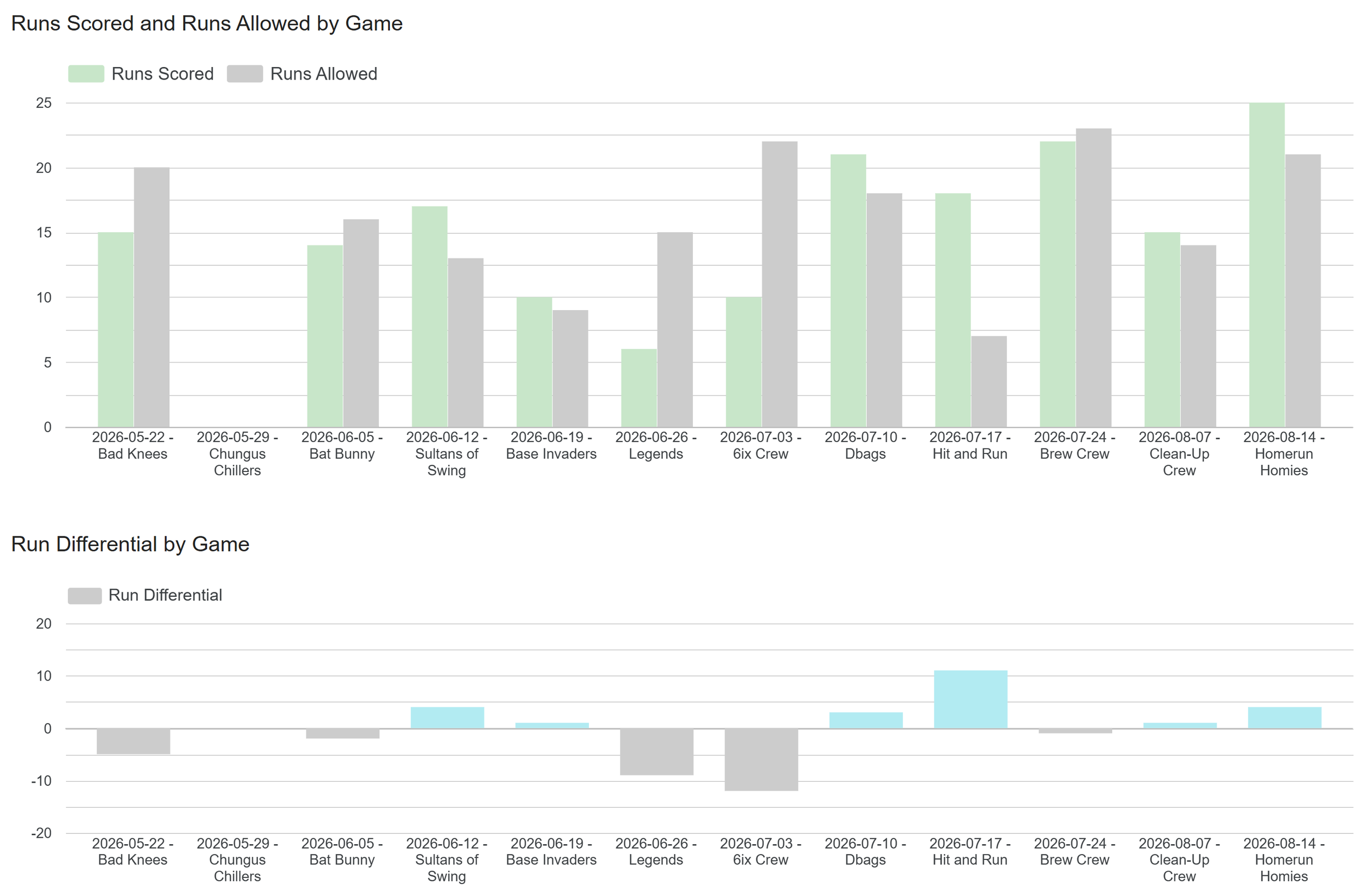
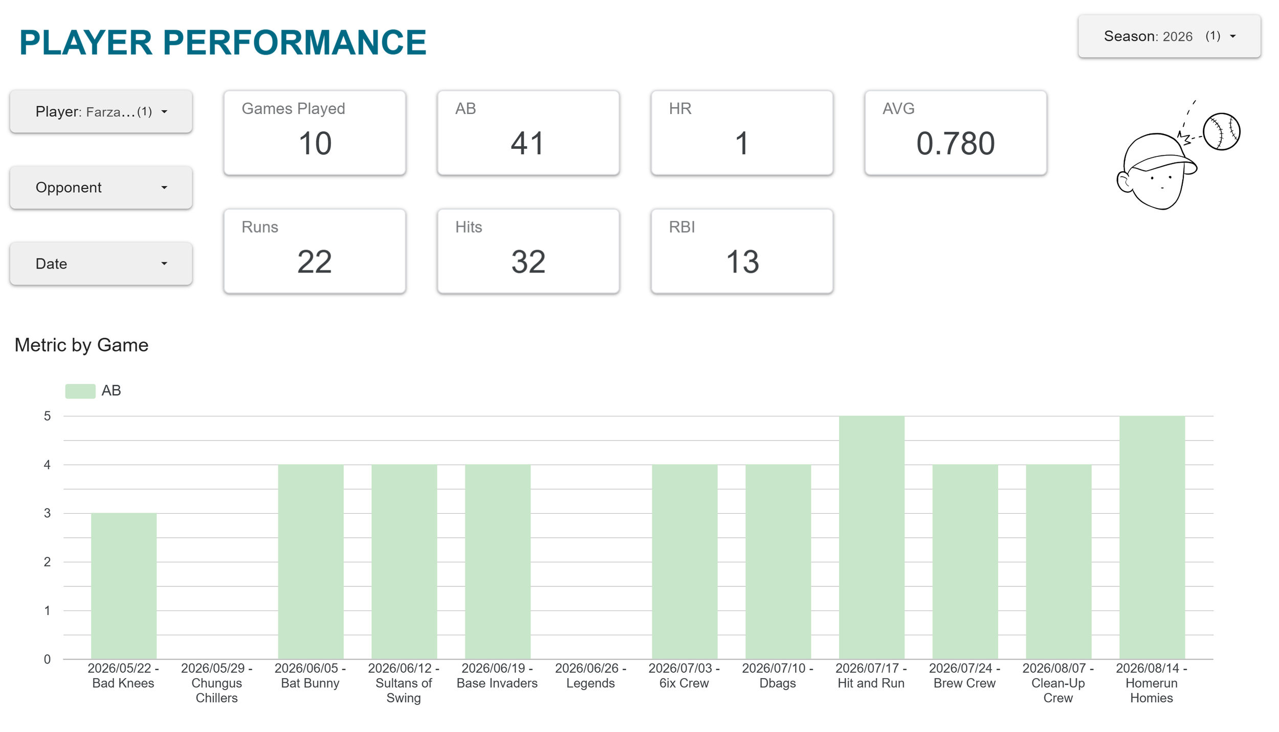
I organized the data in Google Sheets and built an interactive Looker Studio dashboard with team summaries, player leaderboards, game-by-game charts, and filters for exploring performance at different levels.
Impact
The dashboard gave our whole team a much easier way to review the season and compare player performance. It also taught me how important data structure, metric definitions, and visualization choices are when turning raw data into something useful.
Tools
Looker Studio
Google Sheets
Project Link
View the report - Looker Studio
Details for nerds —
How It Works
The dashboard uses Google Sheets as the data source and Looker Studio as the visualization layer.
I stuck with Google Sheets since that was what my coach was already using and he would continue to be the primary user of this tool.
I organized the data into separate tables for players, games, and player statistics, then used calculated fields and filters in Looker Studio to create team summaries, leaderboards, and individual player views.
The most useful charts, as defined by the coach, were implemented with easy and intuitive filter options.
Challenges & Lessons
Structuring the data
The most important part was deciding how game, player, and statistical data should relate to one another. Once that structure was in place, the dashboard became much easier to build.
Defining metrics
Even simple statistics like batting average and run differential needed consistent definitions so they behaved correctly across filters and different dashboard views.
Designing for clarity
The project taught me to focus less on how many charts I could create and more on which ones actually helped answer useful questions about the team.
This was a small project, but it gave me practical experience with the full path from raw data → structured dataset → calculated metrics → dashboard.
It also reinforced that useful visualization depends as much on organizing the data and choosing the right questions as it does on the charts themselves.
A teammate of ours also made a fun little website to showcase the team, come check it out!